Thatchwood now has one place it controls for every reason people visit, and every enquiry arrives already explained.
Where it standsLive at thatchwood.co.za
Year2026
What we builtVenue website, WhatsApp and email enquiries, newsletter and domain email
Thatchwood is a farm pub near Magaliesburg with sport, weekly events and functions, and it lived on Facebook and WhatsApp. We built a loud, practical website that shows what's on and sends every enquiry to the right place, already explained.
A farm pub with sport, weekly events and functions that lived on Facebook and WhatsApp, with bookings on a staff phone.
01
Near Magaliesburg
Thatchwood is a farm pub on the R24 near Magaliesburg: cold drinks, pizza and pub food, sport on the big screens. It runs a weekly line-up from Wednesday to Sunday and private functions for birthdays and bachelor parties.
02
Blood Lotus alongside
Blood Lotus, a tattoo studio, works alongside it.
03
Facebook and WhatsApp
Before the website, the pub lived on Facebook and WhatsApp. Specials and events went out as posts, and bookings went to a staff member's phone.
How it ranBefore
FacebookThe pub's page, for specials and events.
WhatsAppBookings and function enquiries, sent to a staff phone.
GmailEverything else, through a Gmail address.
What was breaking
01
With no website, a search for the pub led to directories and social posts.
02
Bookings and function enquiries all landed on one staff phone.
[02] What we built
Loud on top, practical underneath.
A loud, one-page venue site with its own contact page, prefilled WhatsApp enquiries, a newsletter and domain email.
01
One loud page
A loud, one-page venue site with its own contact page, prefilled WhatsApp enquiries, a newsletter and domain email.
One clear venue story
Pub, events, functions and tattoos, on one page in the order people need them.
01
The specials
A tap from the top
02
What's on
Wednesday to Sunday
03
Blood Lotus
The tattoo studio
04
Private events
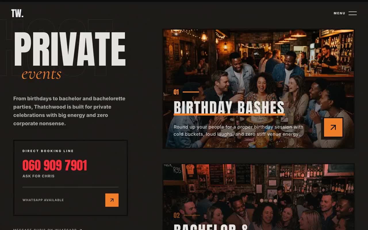
Birthdays and bachelor parties
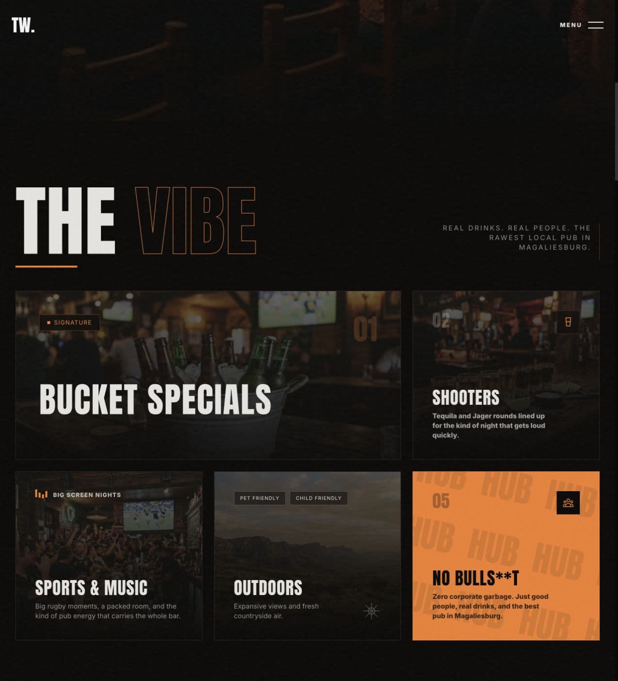
The vibe. The place, people and signature offers are organised without sanding off the noise.
Set up around the site
General and event enquiries from the contact page land in the owner's inbox.
Prefilled WhatsApp messages for specials, events and functions
A contact page that sends enquiries to the owner by email
Newsletter sign-ups collected on the site
Email on the pub's own domain
Analytics
01 / 02
Venue website
For regulars and first-time visitorsthatchwood.co.za
A one-page site with the pub's own humour and colour: the vibe first, then specials, what's on, Blood Lotus, functions and how to get there.
Specials and the weekly line-up
A chapter for Blood Lotus, the tattoo studio
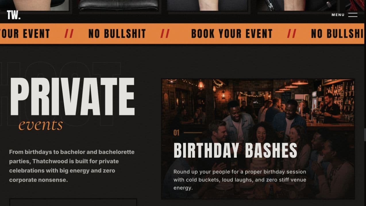
Functions and private parties
Newsletter sign-up
6 real screens · tap to enlarge · select to enlarge
Opening view
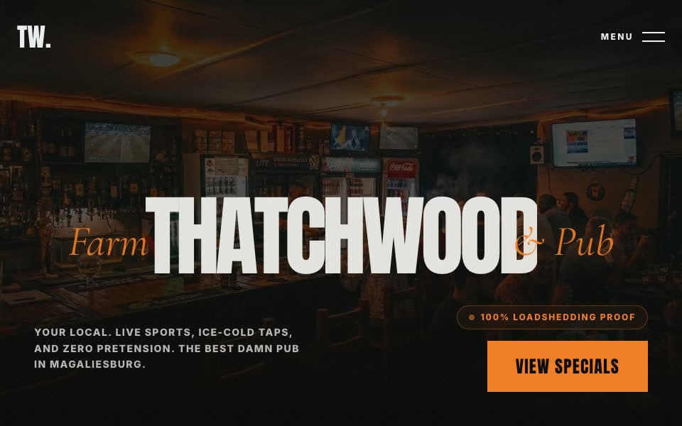
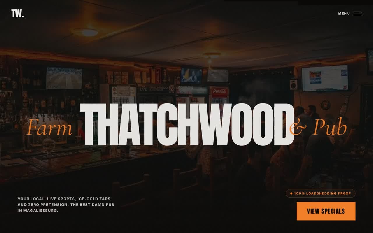
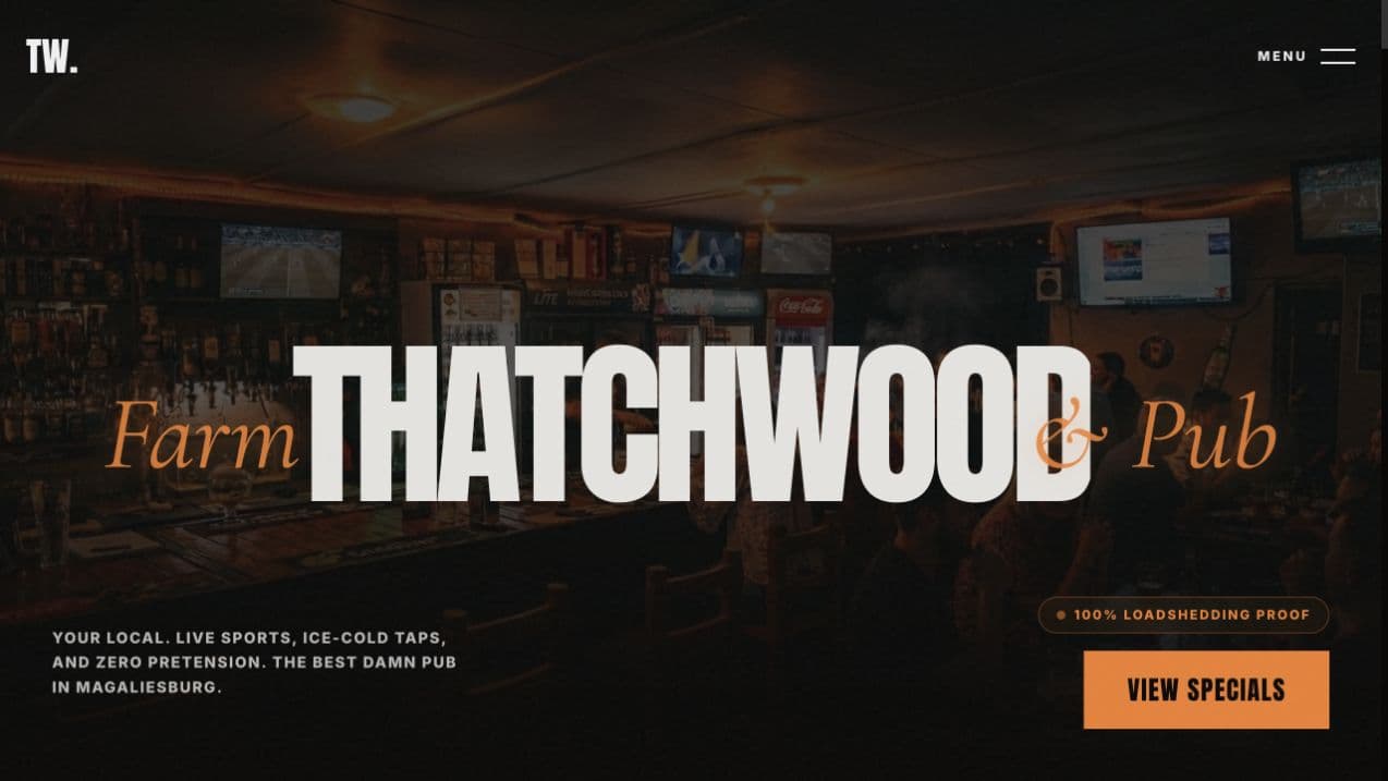
The pub's energy lands immediately, before the practical details take over.
The vibe
The place, people and signature offers are organised without sanding off the noise.
The specials
Regulars can get straight to the information they came for.
What's on
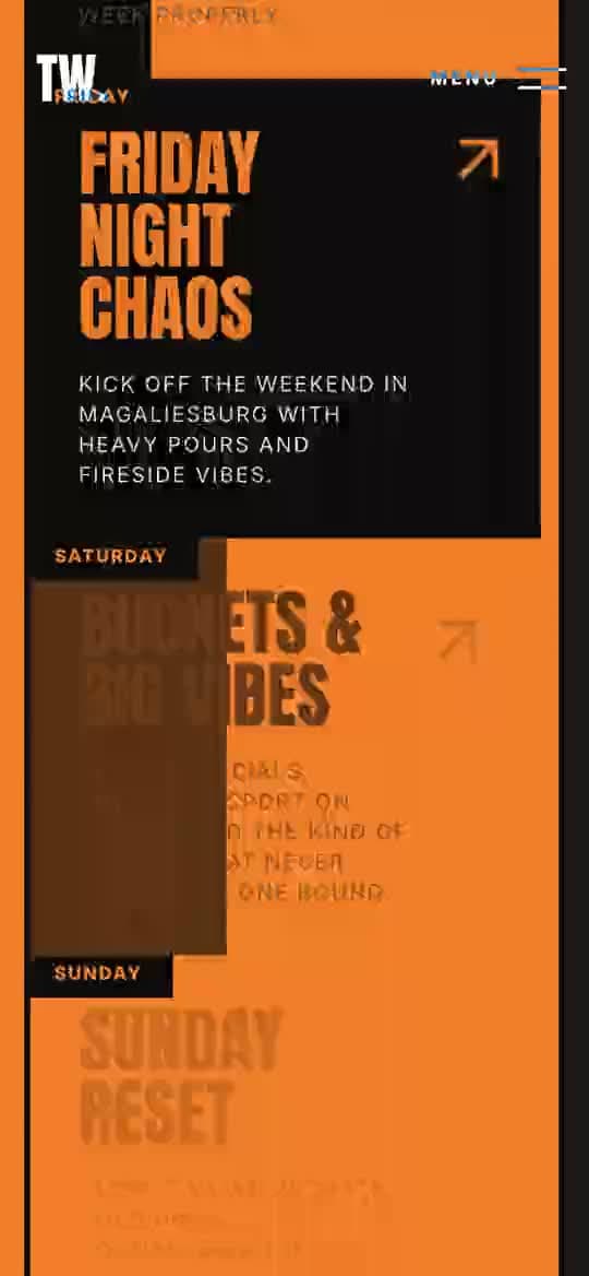
The weekly rhythm is easy to scan without flattening the pub's personality.
Blood Lotus
The tattoo studio gets a complete chapter while still belonging to the same world.
Private events
Groups can understand the offer and move directly into a function enquiry.
Screen 01 / 06
02 / 02
Enquiries
For the pub's teamWhatsApp and email
Buttons for specials, events and functions open WhatsApp with the reason already written. A contact page sends general and event enquiries to the owner by email.
Prefilled WhatsApp messages by reason
Contact form to the owner's inbox
Email on the pub's own domain
WhatsApp, prefilledready to send
Hi! I'd like to ask about booking a function at Thatchwood.
[03] How it works
From a search to a function booked.
Big type, bold colour, movement and real venue photos carry the personality, and each important action has its own route.
The details that move
Recorded on thatchwood.co.za
01
The first screen
The pub's energy lands immediately: big type, bold colour, movement and real venue photos sell the vibe before the details.
02
Specials up front
Specials sit a tap from the top of the page, so regulars get straight to the information they came for.
03
Event cards on phones
On phones, the event cards respond as they scroll into view and the buttons stay easy to tap.
04
Functions, already explained
Each important action has its own route, so an enquiry about a function starts with the reason already written.
Visitor
The first screen sells the vibe.
Visitor
The specials and this week's line-up, Wednesday to Sunday.
Visitor
Functions for birthdays, bachelor parties and private events.
VisitorKey step
WhatsApp opens with the reason filled in, or the contact form sends an email.
Pub team
The team gets the message with the context already there.
Real screenOpening view
[04] What we changed
Organise the noise, keep the character.
We kept the noise and put it in order: the vibe first, then every practical answer in the order people need it.
01
Not a neat template
A neat hospitality template would have sanded the pub smooth. A page full of posters would have been true to it, and hard to use.
02
Noise, put in order
So we kept the noise and put it in order: the vibe first, then every practical answer in the order people need it.
FacebookThe pub's page, for specials and events.
WhatsAppBookings and function enquiries, sent to a staff phone.
GmailEverything else, through a Gmail address.
Before
Now
Before: Facebook, WhatsApp, Gmail. Now: Live at thatchwood.co.za.Drag, or use the arrow keys
01
Before: Scroll Facebook to find the specials.
Now: Specials up front, a tap from the top of the page.
02
Before: Ask on WhatsApp what's on tonight.
Now: The weekly line-up, Wednesday to Sunday, at a glance.
03
Before: Message a staff phone about a party.
Now: A functions section that leads into an enquiry with the reason already filled in.
04
Before: Nowhere the pub's personality could live.
Now: A first screen that sells the vibe before the details.
01 / Real screenThe specials
[05] What changed
One home for every reason to visit.
A first-timer gets a feel for the pub, a regular checks what is on, and a group asks about a function in two taps.
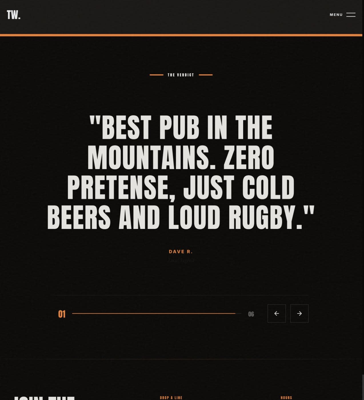
The verdict. The page closes in the same rough-edged visual language.
01
One clear venue story
4
02
From a search to a function booked.
5steps
Where it stands
Live at thatchwood.co.za
Livethatchwood.co.za
Feb 2026→Aug 2026
Dates from our project records and release history.
Start
Build starts.
then, +2 months
Live
Live at thatchwood.co.za; the owner shares it with the pub's events group.
thatchwood.co.za
then, +1 month
Update
Contact form tested with the owner.
then, +3 months
Update
Secure contact page and search setup.
Dates from our project records and release history.
thatchwood.co.za is live, with email on the pub's own domain.
Specials, events and function enquiries arrive with their reason already written.
General and event enquiries from the contact page land in the owner's inbox.
Newsletter sign-ups are collected on the site.
01
One place it controls
Thatchwood has one place it controls for every reason people visit.
02
Every kind of visitor
A first-timer can get a feel for the pub before arriving, a regular can check what is on, and a group can ask about a function in two taps.