Six businesses on one estate, told as one destination, with table bookings on the site itself.
Where it standsLive at melonrouge.co.za
Year2026
What we builtDestination website and table bookings
MelonRouge is six businesses on one Magaliesburg estate: an eatery, records, antiques, books, a boutique and a gallery. We built a destination website that tells each story, plans a day out in the Cradle and takes table bookings online.
Six very different businesses had to share one homepage without becoming a list.
01
Since 2008
MelonRouge has been part of Magaliesburg since 2008. On one family-run estate there is an eatery, AvoRecords for vinyl, BlueCheese Antiques, WormWood Books, the TangyDressing boutique and the Artichoke Gallery, with the Cradle of Humankind on the doorstep.
02
The hard part
That variety is the reason to visit, and the hard part to explain.
03
The old setup
The older website was a Webflow export, with chat and table bookings running through a third-party widget.
How it ranBefore
WebflowAn older website, exported from Webflow.
Booking widgetsChat and table bookings through a third-party tool.
Paper bookThe restaurant's own booking book.
What was breaking
01
Six very different businesses had to share one homepage without becoming a list.
02
Table bookings ran through an outside widget, apart from the site's own design and data.
[02] What we built
A destination, not a directory.
A destination website with a page for each part of the estate, a guide to a day out and table bookings.
01
A page per part
A destination website with a page for each part of the estate and a guide to a day out.
02
Our booking system
Plus table bookings, run on our own booking system.
Six businesses, one estate
On one family-run estate, each part gets its own story and page.
01
The Eatery
Food
02
AvoRecords
Vinyl
03
BlueCheese Antiques
Antiques
04
WormWood Books
Books
05
TangyDressing
Boutique
06
Artichoke Gallery
Art
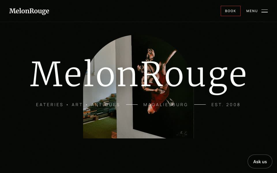
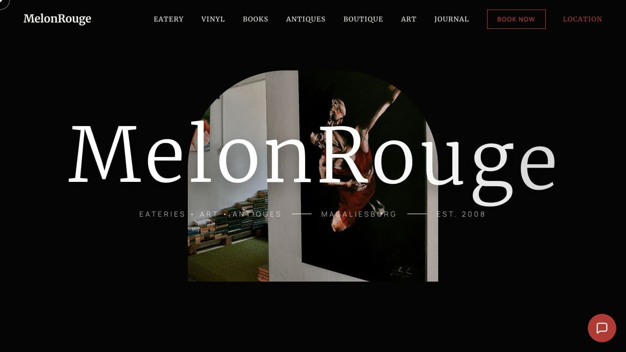
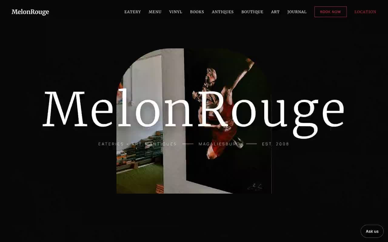
Opening view. The estate introduced as one destination, with every part close at hand.
01 / 02
Destination website
For day visitorsmelonrouge.co.za
A cinematic, editorial site: a dark canvas, big photography and a pace that rewards wandering, with every part of the estate a click away.
A page for each of the six businesses
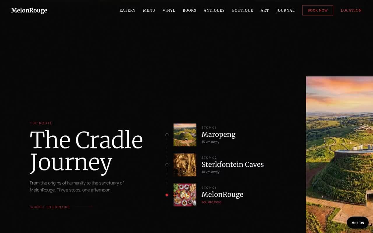
The Cradle journey for planning a day out
Menu and visitor information
A journal for local stories
8 real screens · tap to enlarge · select to enlarge
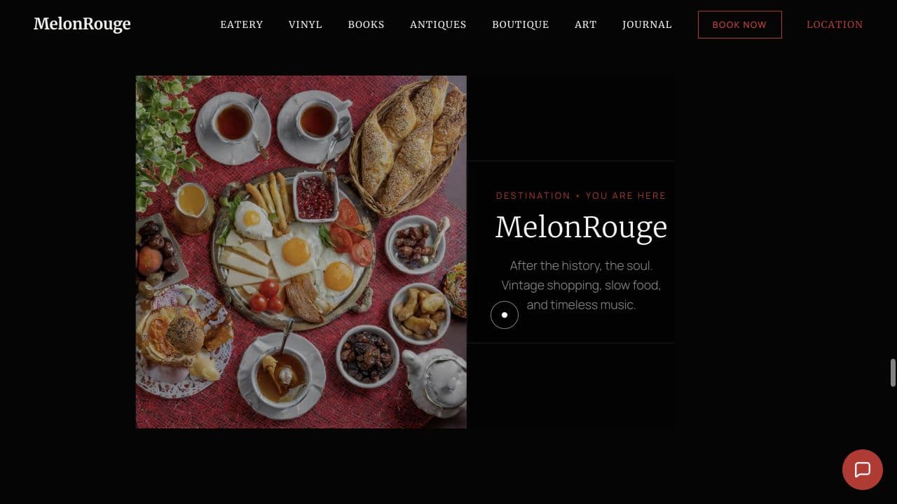
Opening view
The estate introduced as one destination, with every part close at hand.
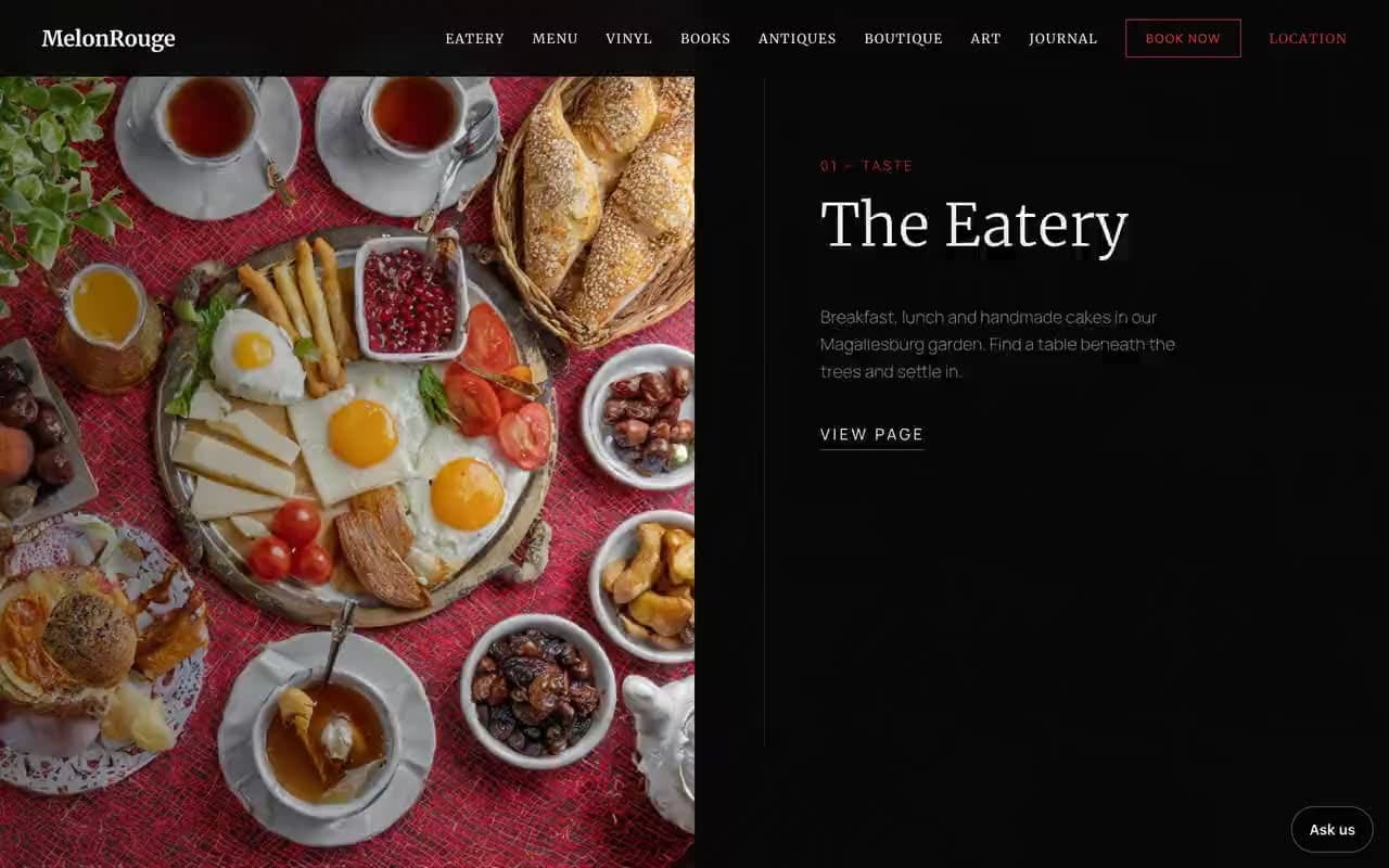
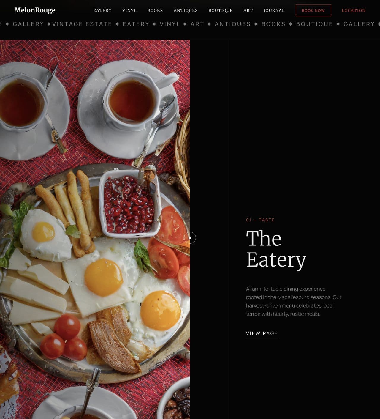
The Eatery
Food and atmosphere lead with enough detail to make the visit feel real.
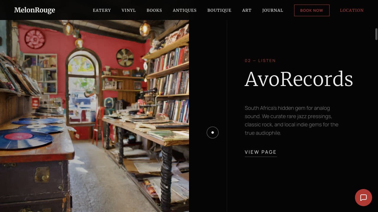
AvoRecords
The vinyl experience gets its own story instead of disappearing into a list.
BlueCheese Antiques
The antique store is treated as a reason to wander, not a footnote.
Artichoke Gallery
A longer editorial view gives the art collection its own character and pace.
Sanctuary
A quieter chapter opens the wider property and its atmosphere beyond the shops.
The Cradle journey
Nearby places become part of a fuller day out rather than an unrelated directory.
Information
The practical details remain easy to find after the more cinematic story.
Screen 01 / 08
02 / 02
Table bookings
For diners and the restaurant teamOur booking system
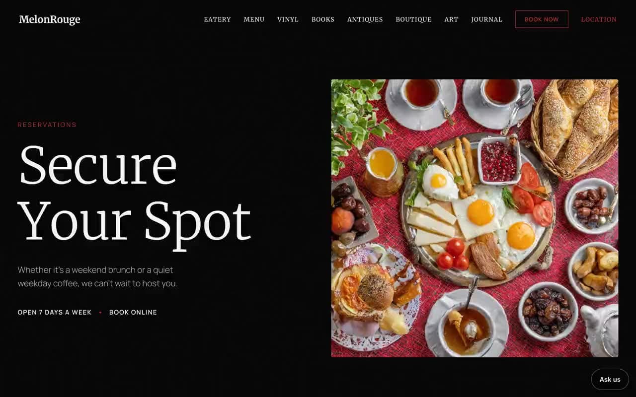
Guests book a table on the site. They get a confirmation by email, and the restaurant gets the booking by email and in its calendar.
Booking on the site itself
Confirmation and cancellation emails
Calendar updates
Confirmed bookings counted in analytics
Real screenPlan the visit
1 real screen · tap to enlarge · select to enlarge
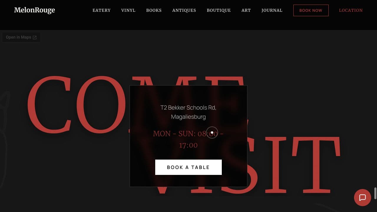
Plan the visit
The final view turns discovery into one clear next step.
[03] How it works
From a first look to a table booked.
The homepage starts with atmosphere, then opens into the estate, with every part a click away.
01
Atmosphere, then the estate
The homepage starts with atmosphere, then opens into the estate. A visitor can follow the whole story or go straight to lunch, records, antiques or art.
02
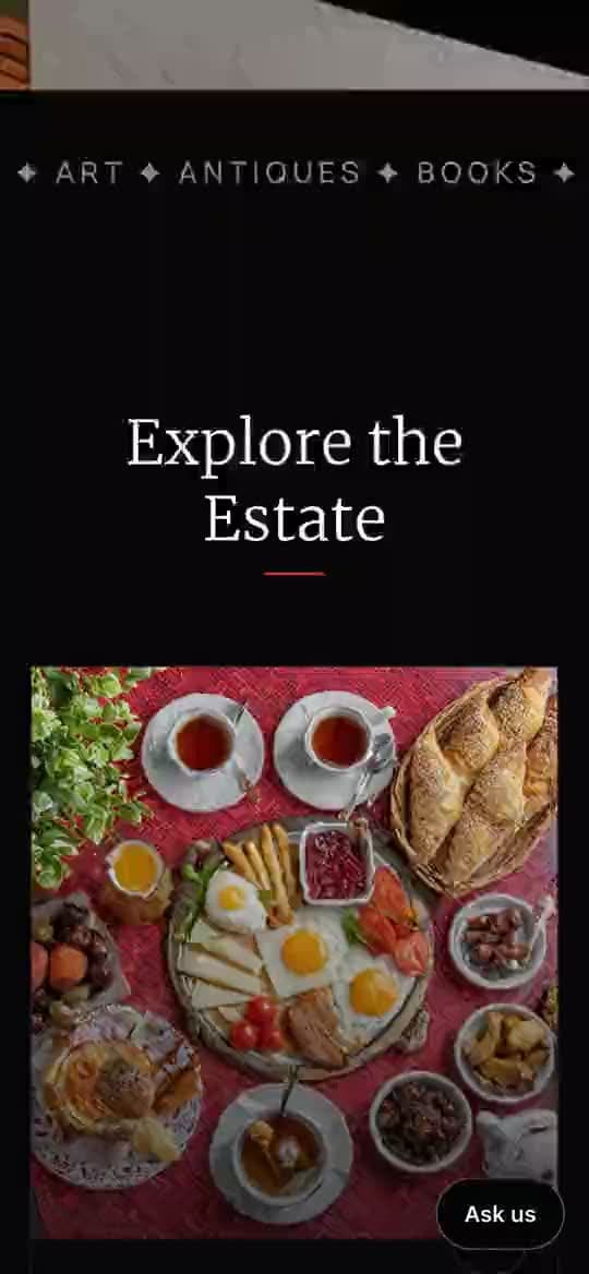
Rich on phones too
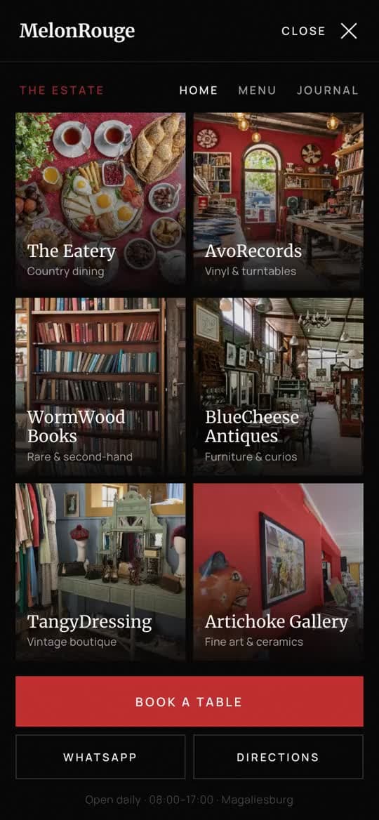
Desktop carries the most cinematic version; on phones, purpose-built cards and simpler touch behaviour keep the story rich without making the phone work hard.
03
Bookings that count
The guest gets a confirmation email, the restaurant gets the booking, and Google Analytics counts confirmed bookings rather than clicks.
The site in motion
Recorded on melonrouge.co.za
01
Atmosphere first
The homepage starts with atmosphere, then opens into the estate.
02
A story for each part
A visitor can follow the whole story or go straight to lunch, records, antiques or art.
03
The Cradle journey
Nearby places become part of a fuller day out: Maropeng, Sterkfontein and more.
04
Cards made for phones
On phones, purpose-built cards and simpler touch behaviour keep the story rich without making the phone work hard.
05
Every part a click away
On a phone, the menu opens onto every part of the estate, with a table booking close at hand.
06
Book on the site
Pick a time and book a table on the site itself, instead of an outside widget.
Visitor
Atmosphere first: the estate as one destination.
Visitor
The eatery, records, antiques, books, the boutique or the gallery.
Visitor
The Cradle journey turns lunch into a day out.
VisitorKey step
Pick a time and book a table on the site.
Restaurant
The guest gets a confirmation, and the team gets the booking by email.
Real screenOpening view
[04] What we changed
Discover the estate one layer at a time.
Make the variety feel like an invitation to wander, and bring table bookings onto the site itself.
01
Wander, not search
Make the variety feel like an invitation to wander, not a directory to work through.
02
Bookings come home
Bring table bookings onto the site itself.
WebflowAn older website, exported from Webflow.
Booking widgetsChat and table bookings through a third-party tool.
Paper bookThe restaurant's own booking book.
Before
Now
Before: Webflow, Booking widgets, Paper book. Now: Live at melonrouge.co.za.Drag, or use the arrow keys
01
Before: A paragraph per business on one homepage.
Now: Each part of the estate gets its own story and page.
02
Before: Records and antiques as a footnote.
Now: AvoRecords and BlueCheese Antiques as reasons to visit.
03
Before: A meal, then the drive home.
Now: The Cradle journey plans a fuller day: Maropeng, Sterkfontein and more.
04
Before: Book through an outside widget.
Now: Book a table on the site, with confirmation emails.
01 / Real screenThe Eatery
[05] What changed
A day out, booked online.
MelonRouge went live in September 2026, with table bookings on our own booking system instead of the old widget.
Opening view. The estate introduced as one destination, with every part close at hand.
01
Six businesses, one estate
6
02
From a first look to a table booked.
5steps
Where it stands
Live at melonrouge.co.za
Livemelonrouge.co.za
Mar 2026→Oct 2026
Dates from our project records and release history.
Start
Design and build start.
then, +6 months
Live
Live at melonrouge.co.za, with our booking system replacing the old widget.
melonrouge.co.za
then, +1 month
Update
Online bookings reach the restaurant team by email.
Dates from our project records and release history.
melonrouge.co.za is live, with every part of the estate on its own page.
Table bookings run through our own booking system instead of an outside widget.
Guests get confirmation and cancellation emails; the restaurant team gets each booking by email.
Analytics counts confirmed bookings and enquiries, not only clicks.
01
Live in September
MelonRouge went live at melonrouge.co.za in September 2026, with bookings on our system instead of the old widget.
02
Bookings by email
Online bookings now reach the restaurant team by email, alongside the book they have always kept.